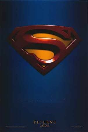
Someone's been lazy with their poster designs.

It's even more amusing since this is the film that Bryan Singer ditched X3 to do, taking a couple of the guys who co-wrote the X2 screenplay with him. (Who are we kidding, X2 was all Singer so there isn't going to be a lot in common between X2 and X3 in terms of vision and composition.)
1 comment:
For some reason, poster design fro super hero movies seems to be a completely different discipline than poster design for other movies.
In point of fact, the stripped down almost minimalism (which dates back to the first Batman movie?) is a nice breath of fresh air compared to most movie pinups, but somehow the pairing with the genre is a bit odd. It seems like an overdramatic mid-combat shot a la 70s superhero comics would be more apt.
Post a Comment